One line in the bond market has flipped negative before every US recession in half a century, and it has never once told anyone the date. That line is the yield curve, and the distance between how reliable it is and how useless it is for timing is the whole story.
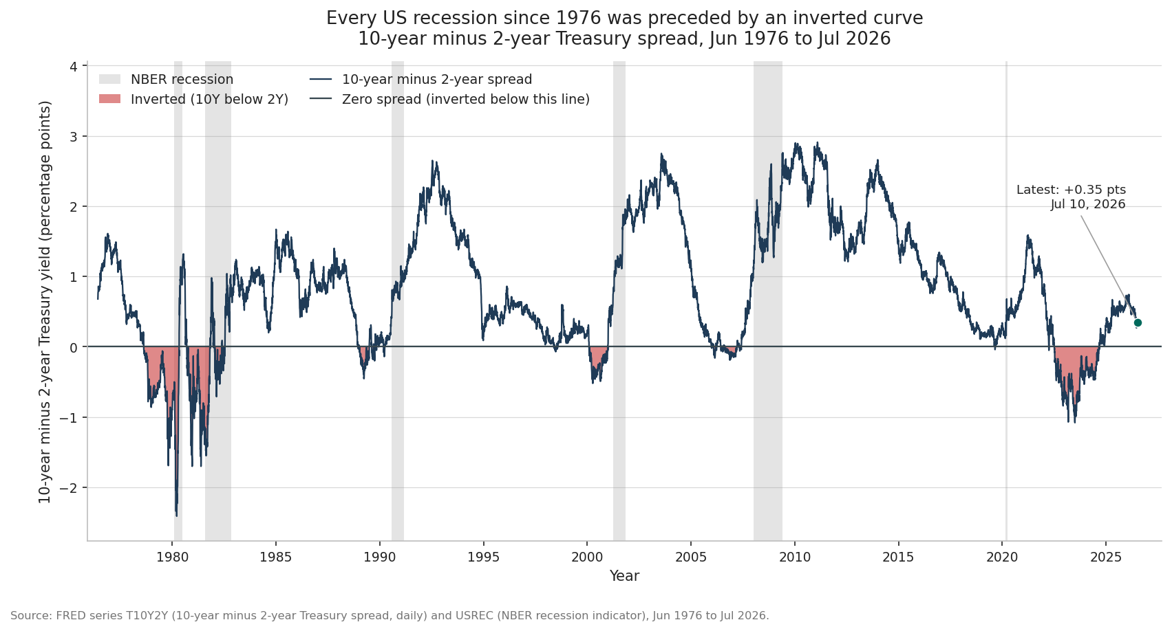
I built this from three series in the Federal Reserve’s FRED database. The 10-year minus 2-year Treasury spread (FRED series T10Y2Y) runs daily from June 1976. The 10-year minus 3-month spread (FRED series T10Y3M) runs daily from January 1982. The NBER recession indicator (FRED series USREC) runs monthly and flags every month the National Bureau of Economic Research has dated as part of a recession. All three run through 2026 in the data behind this article. Read together, they describe a signal that has pointed the right direction almost every time and has been badly imprecise about when. Here is that record in one picture: the 10-year minus 2-year spread across the full fifty years, with inverted stretches shaded red and NBER recessions shaded grey.
What the yield curve is
The yield curve is a plot of Treasury yields across maturities, from the 3-month bill out to the 30-year bond. On a normal day it slopes upward. A lender who ties up money for ten years demands more yield than one who lends for three months, because the longer loan carries more exposure to inflation and surprise. That upward slope is the resting state of a healthy bond market.
The curve inverts when that order flips, when short-term yields climb above long-term yields. The clean way to watch for it is to subtract one yield from another and track the spread over time. The chart above plots the 10-year yield minus the 2-year yield from 1976 to 2026. When the blue line sits above zero, the curve is upward-sloping and normal. When it dips below zero, shaded red in the chart, the 2-year yield has risen above the 10-year, and the curve is inverted. Every grey band in the chart is an NBER recession, and the eye picks up the pattern without any statistics. A red dip appears, then a grey band follows.
A second common measure subtracts the 3-month bill yield from the 10-year, the FRED series T10Y3M. It carries the same information with sharper swings, because the 3-month bill tracks the Fed’s policy rate almost exactly. Analysts watch both. The 10-year minus 2-year is the version I use for the figure, and I will bring in the 10-year minus 3-month where it sharpens the picture.
Why the curve inverts
An inversion looks strange the first time you see it. Why would anyone lend for ten years at a lower yield than for two? The answer is that long yields are not a single decision. A 10-year yield is roughly the market’s forecast of the average short-term rate over the coming ten years, plus a small premium for tying up money that long. The 2-year yield is the same kind of forecast over a shorter window, and the 3-month bill sits almost on top of the Fed’s current policy rate.
Put those pieces together and the mechanism falls out. When the economy runs hot, the Fed raises its policy rate to cool it, which lifts the short end directly. If investors come to believe that tight policy will slow growth enough that the Fed will have to cut rates within a year or two, they price those future cuts into longer maturities today. Expected cuts drag the 10-year down even while the Fed holds the short end high. Short rates high now, long rates pricing the reversal later, and the curve tips below zero.
Read that way, an inverted curve is the bond market forecasting its own rescue. It is the collective statement that policy has been pushed tight enough that a slowdown is coming and the rate cuts that follow it are coming too. In control terms, the Fed has cranked its input high to drive down an inflation error, and the market, watching the system respond, is already pricing the correction on the other side of the overshoot. The signal is not magic. It is thousands of participants with money at stake betting that the current stance cannot last.
The record since the 1970s
The historical record is the reason anyone pays attention. Using the FRED USREC series, the NBER has dated six recessions since the 10-year minus 2-year spread begins in June 1976. Every one of the six was preceded by an inverted 10-year minus 2-year curve. Here is the run, with each lag measured from the nearest inversion of the spread before the recession began, computed from the FRED T10Y2Y and USREC series.
The recession the NBER dates to early 1980 followed an inversion that began in August 1978, a lead of about 17.5 months. That inversion was the deepest in the entire 10-year minus 2-year record. The spread reached 2.41 points below zero on March 20, 1980, per the FRED T10Y2Y series, as the Fed under Paul Volcker drove short rates toward 20 percent to break inflation. The second recession of that double-dip, dated to the summer of 1981, followed a fresh inversion that began in September 1980, a lead of about 10.6 months.
The 1990 recession is a useful lesson in how ragged the real signal looks. The curve first inverted in December 1988, reaching 0.45 points below zero by March 1989, then normalized, then dipped below zero again in March 1990, about five months before the recession began that summer. The 2001 recession followed an inversion that started in February 2000, a lead of about 13.9 months. The 2008 recession, dated by the NBER to December 2007 and January 2008, followed an inversion that began in late December 2005, a lead of about 24.1 months, the longest in the sample.
The 2020 recession is the honest edge case. The 10-year briefly slipped below the 2-year for three days in late August 2019, reaching only 0.04 points below zero in the T10Y2Y data, a marginal and short-lived inversion. The 10-year minus 3-month spread inverted more clearly that year, staying negative through stretches from March to October 2019 and reaching 0.52 points below zero, per the FRED T10Y3M series. The recession the NBER later dated to early 2020 arrived about six months after that August 2019 dip. Its trigger was the pandemic, an external shock no bond market could have been forecasting, so the 2020 case is best read as a curve that had already inverted walking into a blow it did not predict.
Six recessions, six preceding inversions. That is the record you can see in the chart above, and it is why the yield curve sits near the top of every serious list of leading indicators.
The timing problem
Direction is where the curve shines. Timing is where it falls apart. Across those six recessions, the lag from the nearest preceding inversion to the start of the recession ranged from 4.8 months to 24.1 months, with a median of 12.3 months, computed from the FRED T10Y2Y and USREC series. A signal whose lead time swings from under half a year to over two years cannot tell you when to act. It can tell you a storm is more likely. It cannot tell you the hour.
That spread of outcomes has a practical consequence that traders learn the hard way. An inversion can appear and then the market can climb for a year or more before anything breaks. Selling stocks the day the curve inverts has often meant sitting in cash through a long stretch of gains, waiting for a recession that took its time. The signal is real and the reaction to it is a guess about timing, which is exactly the part the signal does not contain.
The record is strong, and it is not perfect. The clearest false alarm in the data came in 1998. The 10-year minus 2-year spread dipped to 0.07 points below zero between May and July of that year, per FRED T10Y2Y, during the collapse of the hedge fund Long-Term Capital Management, and no recession followed for years. Before the FRED series begins in 1976, the near-miss most often cited is the mid-1960s, when the curve flattened hard and growth slowed sharply while the NBER never dated a recession at all. Two cases, decades apart, where the signal fired and no downturn arrived on any near horizon.
There is a live example of the same caution sitting at the right edge of the chart. The inversion that began in July 2022 became the deepest in decades. The 10-year minus 2-year spread bottomed at 1.08 points below zero on July 3, 2023, and stayed below zero for 539 trading days before it climbed back above zero in September 2024, per the FRED T10Y2Y data. On the 10-year minus 3-month measure the same episode ran deeper still, reaching 1.89 points below zero, the most negative reading in that series’ history back to 1982, per FRED T10Y3M. Through the USREC data available in 2026, the NBER has not dated any recession following that inversion. It is the most forceful curve inversion in forty years that has not, so far, been followed by an official downturn. A recession could still be dated for that period after the fact, since the NBER works with a lag of its own. The point is that the deepest signal of the modern era has not yet delivered the event it is supposed to warn about, which is a strong reminder that reliable in direction and reliable on a schedule are two different claims.
Reading the curve in 2026
As of 2026, the 10-year minus 2-year spread stood at 0.35 points above zero, and the 10-year minus 3-month spread stood at 0.71 points above zero, per the FRED T10Y2Y and T10Y3M series. Both are positive. The curve has returned to its normal upward slope after the long inversion of 2022 to 2024. That is a dated reading of a live instrument, and it will be a different number by the time you read this, so treat it as a snapshot and not a verdict.
What the snapshot does not do is settle anything. A normal curve today says the acute inversion warning has switched off. It does not promise clear skies, and a re-inversion is always one policy cycle away. The correct way to hold the yield curve is the way an engineer holds a well-understood sensor. It reads a real quantity, the market’s priced expectation that short rates will fall because growth is set to slow. When it inverts, the reading is worth respecting, because it has preceded every recession in the FRED record since 1976. When you ask it for a date, it goes quiet, because the lead time in that same record runs anywhere from about five months to two years. Respect the direction, distrust the clock, and you are using the instrument for what it measures.