One valuation reading sat near the top of its range before the 1929 crash, again before the 2000 dot-com collapse, and again through the 2010s while the market delivered one of its best decades on record. It is the same measure each time. If a single number can flag a catastrophe and also sit above a boom, the honest question is what it actually tells you and over what horizon.
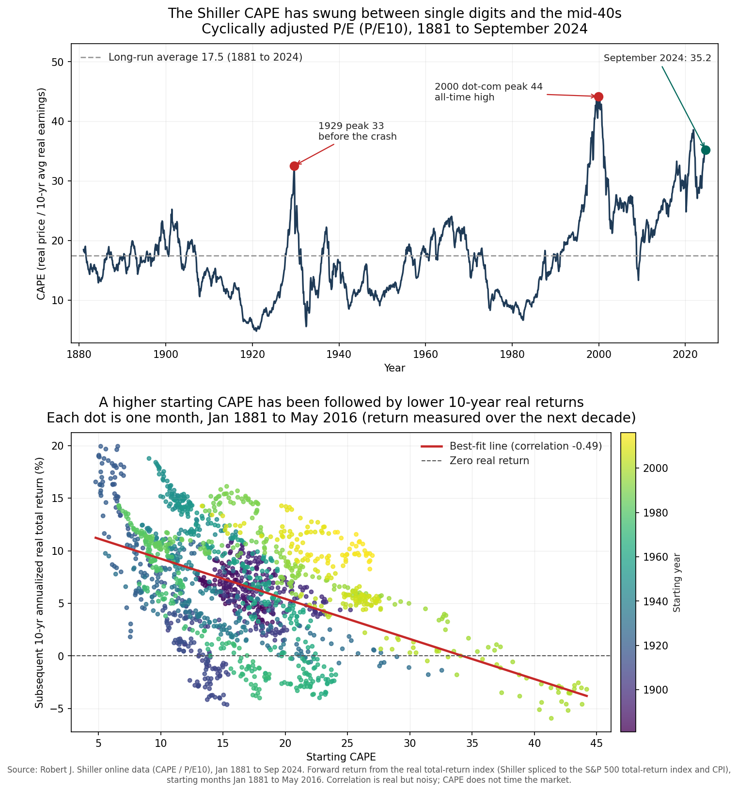
That number is the cyclically adjusted price-to-earnings ratio, written CAPE and sometimes P/E10. Robert Shiller popularized it, and his public dataset runs monthly from 1871. I pulled his CAPE series and paired it with a real total-return index built from his history spliced to the official S&P 500 total-return index and CPI. The relationship it reveals is genuine, measurable, and far weaker than the people who quote it usually admit. The figure below shows both halves of the story: the top panel traces the full CAPE history since 1881, and the bottom panel plots each starting valuation against the real return the market delivered over the following ten years.
The ten-year denominator that changes everything
A normal price-to-earnings ratio divides today’s price by the last year of earnings. That denominator is unstable. Earnings collapse in a recession and spike in a boom, so a plain P/E can read as extremely high at the exact moment a market is cheapest, simply because the “E” cratered. In 2009 trailing earnings fell so far that the standard P/E of the S&P 500 briefly exceeded 100, which measured the size of the earnings hole and told you nothing about real expensiveness.
CAPE fixes the denominator. It divides today’s inflation-adjusted price by the average of the last ten years of inflation-adjusted earnings. Ten years is long enough to contain at least one full business cycle, so the recessions and the booms average out. What remains is a valuation you can compare across decades without a single bad quarter distorting the picture. In control terms, the ten-year average is a low-pass filter on earnings. It strips the high-frequency cyclical noise and leaves the slow-moving signal that valuation is supposed to track.
From Shiller’s data, the CAPE has ranged from 4.78 in December 1920 to 44.20 in December 1999, with a long-run average of 17.5 across 1881 to 2024. The top panel of the figure above plots the full monthly series. It is a landscape of long swings, not a stationary line. The ratio spent the 1910s and early 1920s in single digits, climbed to 32.56 by September 1929, collapsed through the Depression, and stayed subdued for decades before the great ascent that peaked at its all-time high in December 1999.
What a high starting CAPE has actually predicted
Here is the claim that makes CAPE worth studying. A high starting valuation has, on average, been followed by weaker real returns over the following ten years. The bottom panel of the figure tests it directly. Each dot is one month from January 1881 to May 2016, plotting that month’s CAPE against the annualized real total return the market went on to deliver over the next decade. The sample runs to May 2016 because a ten-year forward return needs ten more years of data, so the most recent decade cannot appear yet.
The cloud slopes down, and the correlation across those 1,624 monthly observations is minus 0.49. That is a real relationship. It is also a noisy one. A correlation of minus 0.49 means starting valuation explains roughly a quarter of the variation in subsequent ten-year returns, which leaves three quarters to everything else. Anyone who presents CAPE as a precise forecast is reading a scatter plot as if it were a line.
Splitting the sample by starting valuation sharpens the point. When the starting CAPE sat in the cheapest fifth of history, at 11.1 or below, the subsequent ten-year real total return averaged 10.85 percent a year. When it sat in the most expensive fifth, at 21.3 or above, the subsequent decade averaged 3.57 percent a year. That is a gap of more than seven percentage points a year, compounded over ten years, decided by where valuation started. The medians tell the same story, 10.62 percent from cheap starts against 4.44 percent from expensive ones. The signal is directionally reliable across a century and a half of data.
Look closely at the expensive end of the scatter and the noise reappears. Among the high-CAPE starting points, actual ten-year outcomes range from clearly negative to comfortably positive. The average is low, and the spread around it is wide. High valuation tilts the odds toward disappointment. It does not guarantee it.
Why the modern CAPE runs hotter than the 1900s
A reader who stops at the long-run average of 17.5 will conclude that today’s reading of 35.23, dated to September 2024 in the latest Shiller data, is roughly double fair value and therefore a screaming sell. That comparison is misleading, because the CAPE of the 2020s is not measuring the same thing as the CAPE of the 1900s.
Several structural shifts have lifted the level of the ratio. Accounting rules changed. Mark-to-market and goodwill impairment rules adopted after the 1990s force companies to write down bad assets sharply during downturns, which depresses the trailing ten-year earnings average and mechanically raises the CAPE relative to how the same firms would have reported a century ago. The composition of the index changed too. The S&P 500 of the 1950s was dominated by capital-heavy industrials and railroads that traded at low multiples. Today it is led by software and platform businesses that earn high returns on very little tangible capital and reasonably command higher multiples.
Buybacks changed the arithmetic again. Companies now return cash through share repurchases far more than they did before the 1980s, and repurchased shares raise per-share earnings growth in a way that supports a higher price-to-earnings ratio on the remaining shares. Intangible investment compounds the effect. When a firm spends heavily on research and software, accounting expenses that spending immediately instead of capitalizing it, so reported earnings sit lower than the true economic earnings, which pushes the measured CAPE higher than the underlying value would suggest.
None of this means valuation stopped mattering. It means the correct benchmark for “expensive” drifted upward. Comparing 35 against a 17.5 average that includes 1881 treats a century of accounting and structural change as if it never happened. A more defensible reading compares today against the post-1990 range, where the CAPE has spent most of its time between the low 20s and the mid-40s. On that scale today’s reading is elevated. It is not the historical outlier the raw average implies.
The timing trap that ruins the signal
The ten-year story and the timing story are opposites, and confusing them has cost people real money. A high CAPE says something about the average annual return over the next decade. It says almost nothing about the next month, the next year, or even the next several years. The signal is slow. Markets are not required to correct on any schedule that suits the person watching the ratio.
The 1990s are the cautionary case. The CAPE crossed 25, a level that had marked the 1929 top, in the middle of the decade. An investor who sold then, treating 25 as a ceiling, would have watched the market climb for years more as the ratio ran all the way to 44.20 by the end of 1999. Selling on a high CAPE in the mid-1990s meant sitting out some of the largest gains in market history before the eventual crash, and the crash did not erase the lead that staying invested had built.
The 2010s make the same point from the other direction. The CAPE sat above its long-run average for essentially the entire decade, flashing “expensive” year after year. An investor who stayed out on that signal missed a decade of strong real returns. The valuation was elevated the whole time and the returns arrived anyway. This is why the two crash peaks on the top panel of the figure are seductive and misleading. Yes, the ratio was high before 1929 and before 2000. It was also high during long stretches when nothing bad happened next, and no version of the signal told you in advance which kind of “high” you were living through.
A negative correlation over a ten-year horizon and a useless trigger for market timing are perfectly consistent. The relationship lives in the average of many overlapping decades. Any single starting point can land anywhere in that wide scatter, and the market can stay expensive far longer than a timing bet can stay solvent.
What the ratio is good for
CAPE earns its keep as an input to expectations, not as a switch for entering and exiting the market. When the starting valuation is high, the reasonable base case is a lower real return over the coming decade, which is a reason to save more, to temper projections, and to check that a plan does not secretly assume the returns of a cheap starting point. When valuation is low, the historical odds shift toward stronger returns, which is a reason to keep buying through the fear instead of fleeing it.
The illustrative best-fit line through the scatter, extended to today’s reading of 35.23, sits near zero real return for the coming decade. I put no weight on that specific number and neither should you. It is one point on a noisy line fit to a century of data under accounting rules that no longer fully apply, and the spread around it is enormous. The durable lesson is the direction and the horizon. Starting valuation and subsequent ten-year real return move against each other, the effect is large enough to matter for how you plan, and the whole relationship dissolves the moment you try to use it to time a single trade.
Read the CAPE the way an engineer reads a slow sensor. It carries real information about the state of the system, it updates on the scale of years, and treating a slow measurement as a fast trigger is how you introduce oscillation into a system that was fine before you touched it. Set your expectations by it. Do not set your calendar by it.