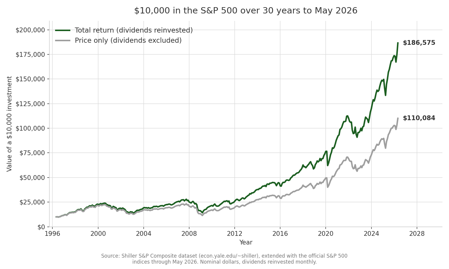
Over the 30 years ending 2026, 10,000 dollars in the S&P 500 grew to about 110,000 on price alone and about 187,000 with dividends reinvested. Most quoted “returns” show you the first number and hide the second.
That gap is not a rounding error. It is 76,000 dollars on a 10,000 dollar stake, and it comes from a mechanism almost every headline leaves out. When a news anchor says the S&P 500 is up 8 percent this year, or a chart shows the index crossing some round-numbered level, that figure is the price return. It tracks the level of the index and nothing else. The money companies paid out to their owners, and what those payments earned once put back to work, sits in a different series that most people never open.
I pulled Robert Shiller’s monthly S&P Composite dataset, which runs back to 1871, and computed both paths directly. The dataset carries a price-return index that excludes dividends and a total-return index that reinvests each month’s dividend at that month’s price. The code that produced every number here is in the article folder, so you can rerun it and check the arithmetic yourself. The chart below plots both paths over the 30 years to 2026.
Two Numbers That Sound Like One
Price return measures one thing. It is the change in the market price of what you hold. Buy the index at a level of 661, watch it climb to 7,279, and your price return is the ratio between those two numbers. Simple, visible, and incomplete.
Total return adds the cash a company hands its shareholders, the dividend, and then assumes you buy more shares with it. A dividend is a slice of profit paid out in cash, quoted as an annual amount. The S&P 500 has paid a dividend yield somewhere around 1 to 4 percent across recent decades, depending on where prices sat. That sounds small next to the price swings that make the news. Over a long horizon it is the opposite of small.
Here is the mechanism in plain terms. A company earns a profit. It keeps some to reinvest in the business, which (if it works) lifts the share price, and that shows up in price return. It pays out the rest as a dividend, which does not show up in price return at all. If you spend that dividend, it is gone from your investment. If you reinvest it, it buys more shares, and those new shares earn their own dividends next quarter, which buy still more shares. The payout stops being a small annual trickle and becomes a second engine running underneath the price.
Think of it the way a control engineer reads a system. Price return is the position of the output. Total return is the position plus the integral of everything the system paid out along the way and fed back into itself. Ignore the feedback term and your model of the system is wrong, quietly and consistently, in the same direction every year.
The 30-Year Gap, Computed From Real Data
Take a fixed window. May 1996 to 2026, exactly 30 years, 10,000 dollars invested at the start.
On price alone, that 10,000 dollars became 110,084 dollars. The index rose 11.01 times over the three decades. That is the number a price chart shows you, and on its own it looks like a fine outcome.
With every dividend reinvested, the same 10,000 dollars became 186,575 dollars, a multiple of 18.66 times. The reinvested dividends and their compounding added 76,491 dollars on top of the price-only result. That is a 69.5 percent premium. The total-return investor ended with about seventy percent more money than the price-only figure suggests, from the same index, over the same 30 years, starting with the same stake.
The figure in this article plots both paths. The two lines start together at 10,000 dollars in 1996 and are nearly indistinguishable for the first few years. Then they separate, and the gap between them widens every year, because the total-return line is compounding on a base that the price line never builds. By 2026 the green total-return line sits far above the grey price-only line, and the vertical distance between them at the right edge is that 76,000 dollars.
Notice the shape of the divergence. In the flat, choppy stretch from 2000 to 2012, when price return went almost nowhere on net, the total-return line kept pulling ahead. Dividends do not wait for a bull market. They arrive every quarter regardless of what the price is doing, and reinvesting them during a sideways decade quietly buys shares at prices that later rose. The 2000 to 2012 span in the chart is where the two engines most visibly part company.
In annualized terms, the price-only path compounded at 8.32 percent a year over the 30 years. The total-return path compounded at 10.25 percent. That difference, about two percentage points a year, is the entire story. It looks tiny on any single year. Run it for 30 years and it lifts the ending balance by about seventy percent.
Why Two Points a Year Becomes a Doubling
The reason a two-point annual gap explodes into a 69.5 percent difference in ending wealth is compounding, and compounding rewards small edges that persist.
At 8.32 percent, money doubles roughly every 8.7 years. At 10.25 percent, it doubles roughly every 7.0 years. Over 30 years the slower rate fits in about 3.5 doublings and the faster rate fits in about 4.3. That extra fraction of a doubling, applied to a base that has already grown large, is where the 76,000 dollars comes from. The dividend contribution is not the payouts themselves. It is the payouts compounded across three decades of reinvestment.
This is why dividends look trivial in any short window and decisive in a long one. A single year’s dividend yield of 2 percent is genuinely a small number. The same 2 percent, reinvested and left to compound on top of itself for 30 years while the underlying price also grows, is the difference between 11.01 times and 18.66 times your money.
The Shiller data lets me push the horizon further, and the full history makes the point starkly. From 1871 to 2026, the S&P Composite price index compounded at 4.88 percent a year. The total-return index compounded at 9.37 percent a year. Across 155 years, reinvested dividends and their compounding account for roughly half of the annual return the index actually delivered. Extended over that many decades, the two engines produce cumulative multiples so far apart that the price-only figure captures almost none of the total dollar growth. That is an artifact of very long compounding, and it is worth stating carefully so no one misreads it: dividends did not out-earn price appreciation year by year. Over one and a half centuries of reinvestment, their compounded contribution grew to dominate the total.
Morningstar and Hartford Funds have published a widely cited estimate that dividends have contributed roughly 40 percent of the total return of US large-cap stocks since the 1930s, and closer to a third over some sub-periods, depending on the window measured. That is their estimate from their chosen dataset. My 30-year figure from Shiller, where reinvested dividends supplied 43.3 percent of the total dollar gain, lands squarely in the same territory. Different sources, different windows, same conclusion. A large share of long-run equity return is dividends put back to work, and none of it appears in a price chart.
The Tax Nuance That Decides Where You Hold This
There is a catch that separates the theory from what lands in your account, and it comes down to which kind of account holds the shares.
In a tax-sheltered account, an IRA or a 401(k), the reinvestment happens with no tax friction along the way. Every dividend rolls straight back into new shares. The 18.66 times figure, the clean total return, is close to what a long-term holder in a sheltered account actually experiences, before any fund fees.
In a taxable brokerage account, reinvested dividends are taxed in the year they are paid, even though you never see the cash and immediately buy more shares with it. Qualified dividends get the lower long-term capital gains rate, which for many investors sits at 15 percent. The tax is owed annually regardless of whether you spend or reinvest the payout. That yearly drag skims a little off the top of the compounding engine every year. It does not erase the dividend advantage, and it is smaller than the advantage itself, but it does mean the after-tax total return in a taxable account falls somewhere between the price-only and the pre-tax total-return lines in the chart.
This is why the account matters as much as the asset. The same S&P 500 index fund produces the full compounding effect in a Roth IRA and a slightly dented version in a taxable account, purely because of when the dividend is taxed. It is one of the cleaner arguments for holding dividend-paying, broadly diversified equity funds inside sheltered accounts when you have the room, and reserving taxable space for holdings that throw off less annual taxable income.
What To Actually Do With This
Three practical corrections follow from the numbers.
First, when you compare your own portfolio to “the market,” make sure you are comparing total return to total return. A fund’s reported return already includes reinvested dividends, so measuring it against a bare price chart of the S&P 500 flatters the fund by roughly two percentage points a year. That is enough to make a mediocre fund look like it beat the index when it did not. The fair benchmark is the S&P 500 total-return index, often labeled with “TR” or “total return,” not the plain index level.
Second, treat any long-run projection that quotes a price return as understated. A retirement model that assumes the S&P 500 compounds at 8.32 percent is using the price-only history. The total-return history is closer to 10.25 percent nominal over the last 30 years, and about 9.37 percent over the full record. Which number you feed a 30-year projection changes the answer by a lot, in the direction of more money than the price figure implies, provided the dividends are actually reinvested and not spent.
Third, if you hold index funds, reinvest the dividends unless you specifically need the income. Most brokers offer automatic dividend reinvestment as a checkbox. Leaving it off, and letting dividends pile up as idle cash, is the difference between the grey line and the green line in the chart. Over 30 years on a 10,000 dollar stake, that checkbox was worth 76,000 dollars.
The price return is the number everyone quotes because it is the number that scrolls across the screen. The total return is the number you actually earn. They are not the same series, and across any long horizon the gap between them is one of the largest, most reliable, and most ignored figures in investing.
Sources
- Robert J. Shiller, “Irrational Exuberance” dataset, monthly S&P Composite price, dividend, and total-return series, http://www.econ.yale.edu/~shiller/data.htm, for the deep history. The recent months are extended with the official S&P 500 price and total-return indices and CPI so the series runs to the latest month. All dollar figures, multiples, and annualized returns in this article were computed directly from that dataset.
- Morningstar and Hartford Funds, “The Power of Dividends: Past, Present, and Future,” published estimates of the dividend contribution to long-run US large-cap total return.