Imagine a senior data scientist at a tech company. They spend their days building observability dashboards — monitoring P99 request latency, tracking feature flag rollout rates, watching error budgets tick down in real time. They understand deeply that good monitoring means tracking leading indicators: the inputs that predict future outcomes, not the outputs that report on the past.
Then they go home, open their brokerage account, and check their net worth.
This is a category error so common it goes unnoticed. The same person who would never run production systems on lagging indicators is running their own financial future on one. They check net worth — a pure historical output — and derive zero actionable signal from it. The number goes up, which feels good. The number goes down, which feels bad. Neither feeling corresponds to a decision they can make today to change the trajectory.
The metric they should be checking is their savings rate. And most of them are not checking it at all.
Leading vs. Lagging: The Dashboard Distinction
In observability and site reliability engineering, the distinction between leading and lagging indicators is foundational.
A lagging indicator reports on what already happened. It is an output metric — useful for post-mortems and historical analysis, but structurally incapable of telling you what to do right now. Yesterday’s error rate. Last quarter’s revenue. Current net worth. By the time a lagging indicator changes, the decisions that caused it are weeks or months in the past.
A leading indicator predicts what is about to happen. It is an input metric — actionable today, causally upstream of the outcome you care about. CPU utilization before a server crashes. Deployment frequency before engineering velocity stalls. Savings rate before the retirement date shifts.
The key property of a leading indicator is that it is controllable. You can act on it now and observe the effect in the output later. That causal link — decision → leading metric → lagging outcome — is what makes it useful for monitoring and correction.
Net worth fails the controllability test entirely. On any given month, your net worth reflects the S&P 500 return (outside your control), the vesting schedule of your employer equity grant (outside your control), the current appraisal of your home (outside your control), and the dollar/yen exchange rate if you hold international funds (outside your control). The signal you contributed — your monthly savings — is a rounding error compared to the market noise swamping it.
Checking net worth monthly is like monitoring your server health by asking customers how they feel about the product. The signal is real but it is lagged, diluted, and too slow to act on.
The Formula That Makes Savings Rate the Only Variable That Matters
The theoretical case for savings rate as the primary financial KPI is not just intuitive — it is derivable from first principles.
The financial independence timeline can be expressed as:
t = ln(1 + 25r(1 − s) / s) / ln(1 + r)Where t is years to financial independence, r is real investment return, and s is your savings rate. The target is a portfolio 25 times your annual expenses — the standard derived from the 4% safe withdrawal rate.
Notice what is absent from this formula: income. It canceled out. Your gross salary does not appear in the equation. Your total compensation does not appear. The timeline to financial independence is determined entirely by two variables: r (the market return, which you cannot control) and s (your savings rate, which you control completely).
This is not a simplification. It is a precise mathematical result. A software engineer earning $120,000 with a 50% savings rate reaches financial independence in the same number of years as a surgeon earning $400,000 with a 50% savings rate. The incomes are different by a factor of 3.3. The timelines are identical. Income determines the absolute size of the portfolio at the finish line, not the number of years it takes to get there.
The savings rate is the sole leading indicator of your financial independence timeline. Everything else — income, investment vehicle, portfolio size today — is either noise or a downstream output.
| Savings Rate | Years to FI (at 7% return) |
|---|---|
| 10% | ~43 years |
| 20% | ~37 years |
| 30% | ~28 years |
| 40% | ~22 years |
| 50% | ~17 years |
| 60% | ~12.5 years |
| 70% | ~8.5 years |
The chart below plots the same relationship, with income dropping out entirely.
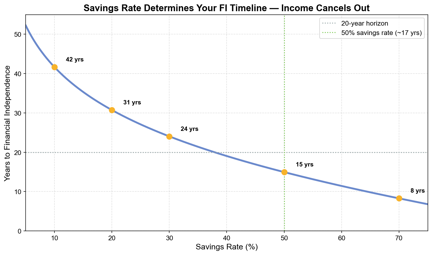
The nonlinearity here is striking. Moving from 10% to 20% savings rate saves 6 years. Moving from 40% to 50% saves 5 years. Moving from 60% to 70% saves 4 years. The returns diminish in absolute years but each jump is still compressing a decade of working life into a smaller window — because higher savings simultaneously increases contributions (more capital deploying) and decreases the target (lower expenses require a smaller portfolio).
A $50,000 raise does not move you on this table at all unless it changes your savings rate. A $5,000 reduction in annual expenses moves you significantly, because it changes s directly and reduces the portfolio target simultaneously.
Why Net Worth Is Actively Misleading in the Short Term
Beyond being uninformative, net worth can be actively counterproductive as a primary tracking metric — because it produces behavioral responses disconnected from the decisions that actually matter.
Consider two engineers in a bull market. Both have 30% savings rates. Both are on identical trajectories toward financial independence. One has their savings in a growth-heavy equity portfolio; the other in a more balanced allocation. In a strong market year, Engineer A’s net worth increases 25%. Engineer B’s increases 12%. Neither took any action that affected their FI timeline — their savings rates held steady, their contribution amounts did not change, their behavior was identical. But Engineer A feels ahead and Engineer B feels behind.
Now flip the scenario to a bear market. Both see their net worth decline significantly. Neither’s savings rate changed. Neither’s timeline to FI changed materially, because they continued contributing and buying more units at lower prices. But both feel worse, and the one checking net worth obsessively is more likely to take a behavioral action (panic selling, halting contributions, increasing cash allocation) that actually does damage the timeline.
Net worth watching creates phantom signals — apparent information that triggers real behavior, none of which correlates with the actual leading indicator driving the outcome. This is the financial equivalent of optimizing your system based on customer sentiment scores during a regional internet outage. The signal is real; the causal model is wrong.
The Closed-Loop Control System
The reason savings rate is the right metric to monitor is not just that it is more informative — it is that it enables a closed-loop control system with appropriate feedback frequency.
In control theory, a closed-loop system continuously measures the output, compares it to the target, computes the error, and applies a correction. The feedback loop runs fast enough to detect and correct errors before they compound into large deviations. A thermostat does not check the temperature annually and make a single large adjustment — it samples continuously and makes micro-corrections to maintain the setpoint.
Tracking savings rate monthly creates exactly this control structure for your finances. The measurement is high-frequency (monthly). The error signal is clear (actual rate vs. target rate). The correction is actionable (adjust spending before next month). The loop runs twelve times per year, detecting drift early and correcting it with small adjustments.
In contrast, tracking net worth annually — or even monthly — creates an open-loop system with high latency. You observe an output variable that reflects a full year of decisions plus external market noise. The error signal is ambiguous (was the net worth change from my decisions or from the market?). The correction, if any, is large and delayed. By the time you respond, the cause is months in the past.
A closed-loop system with monthly savings rate monitoring detects overspending in February and corrects it in March. An open-loop system monitoring net worth annually detects a problem in December that started in January. Eleven months of drift have compounded. The correction is painful because it has to be large.
The CPU Utilization Analogy
There is a direct systems analogy for the relationship between savings rate and net worth that makes the monitoring choice obvious.
Savings rate is CPU utilization. Net worth is the work completed.
If CPU utilization is consistently high and the workload is well-specified, completed work is a mathematical inevitability. You do not need to obsessively monitor the output queue to know the work will get done — you need to ensure the utilization stays high and the process does not get interrupted.
If CPU utilization drops — savings rate falls, contributions stop, lifestyle inflation consumes the increment — the output queue stalls regardless of how much work was previously completed. Net worth can be high while the machine is idle. But the machine is not running.
Monitoring net worth instead of savings rate is watching the output queue and ignoring CPU utilization. You can observe a large queue and feel confident while the processor is actually throttled to 5% utilization. The queue will eventually empty. The warning sign was always in the utilization — not in the queue size.
Set your savings rate target. Track it monthly, not net worth. Minimum 20% for a standard timeline; 50% if financial independence within 17 years is the goal. Automate the transfer before you see the paycheck so the utilization is structural, not voluntary.
The output — net worth, financial freedom, the terminal number — is a downstream consequence of sustained high utilization. You do not need to stare at it to know the system is working. You need to make sure the processor never idles.
This article is adapted from Chapter 1 of Debugging Your Personal Finance, which establishes savings rate as the primary leading indicator of wealth. Chapter 10 builds this into a complete four-zone financial monitoring dashboard — the full cockpit for tracking North Star (altitude), Solvency (fuel), Trajectory (heading), and Efficiency (engine) — so that every metric you watch is causally upstream of the outcome you want.