A dollar put in the S&P 500 in August 2001 grew to about ten dollars. The same dollar in developed markets outside America grew to under five. Most investors read that as a verdict. It is closer to a warning label.
I spend my days building systems, and one habit carries over to money. When one component has outperformed every backup for a long stretch, that is exactly when I start asking what happens when it does not. A part that has never failed in the window you have watched is not a part that cannot fail. It is a part whose failure you have not sampled yet. US stocks have beaten international developed markets for so long that owning anything else feels like a drag. That feeling is the whole reason the diversification exists.
Here are the numbers, computed from total-return prices through 2026, and none of them are hard to verify. Over the roughly 25 years since August 2001, the SPDR S&P 500 ETF (ticker SPY, a US large-cap fund) turned one dollar into 10.02 dollars, a compound annual growth rate of 9.71 percent with dividends reinvested. The iShares MSCI EAFE ETF (ticker EFA, which holds developed markets in Europe, Australasia, and the Far East) turned the same dollar into 4.77 dollars, a growth rate of 6.49 percent. The US finished the window ahead by a factor of 2.10 relative to where it started against international. That is the top panel of the figure below, plotted on a log scale so the early and late years are legible together.
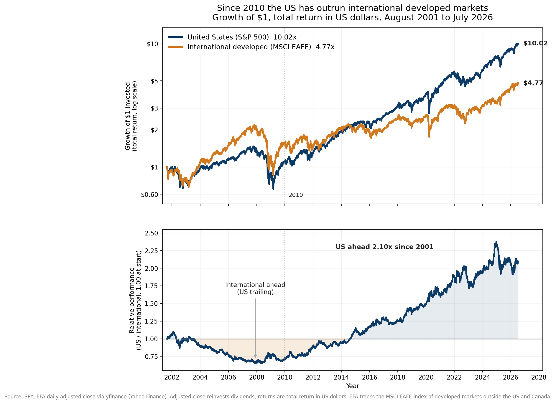
The lead is real, recent, and one of the widest on record
The gap is not evenly spread across those 25 years. Split the window at the start of 2010 and it separates into two different worlds.
From August 2001 through the end of 2009, international led. Over that stretch the US fund compounded at 1.19 percent a year while the international fund compounded at 5.32 percent. A dollar in the US grew to 1.10 by the end of 2009. The same dollar abroad grew to 1.54. At the widest point, reached in late November 2007, the US had fallen 54 percent behind where it started against international. That period has a name people still use, the lost decade, and it was lost only if you were fully home-biased in American stocks.
From January 2010 through 2026, the picture inverts and then some. The US fund compounded at 14.18 percent a year. The international fund compounded at 6.92 percent. Over that span a dollar in the US became 8.93 dollars while a dollar abroad became 3.02, so the US delivered close to three times the total return, a ratio of 2.96. The annual gap, 7.26 percentage points a year for more than sixteen years, is enormous. To sanity-check that the result is not an artifact of one fund, the Vanguard Total Stock Market ETF (ticker VTI, which holds the entire US market and not only large caps) compounded at 13.98 percent over the same post-2010 window, within a fifth of a point of SPY. The US win is a feature of the whole US market, not of one index.
The bottom panel of the figure tracks the relative line directly, the US fund divided by the international fund and rebased to 1.00 at the start. It sinks through the 2000s while international leads, bottoms during the financial crisis, and then climbs almost without interruption for the entire 2010s and into the 2020s. The shape matters as much as the endpoints. A line that has gone one direction for fifteen years produces a powerful and specific illusion, that the direction is a property of the world instead of a phase of it.
Recency bias makes fifteen years feel permanent
There is a well-documented wiring problem in how people forecast, and it has a name in the behavioral finance literature. Recency bias is the tendency to weight recent experience far more heavily than older experience when estimating what comes next. Daniel Kahneman and Amos Tversky described the underlying mechanism, the availability heuristic, in work going back to the 1970s. We judge how likely something is by how easily examples come to mind, and recent, vivid examples come to mind most easily.
Apply that to a fifteen-year run of US dominance. Anyone who started investing after 2010 has never seen international win. Their entire lived sample says the same thing the relative line in the chart above says, that US stocks simply go up more. The 2000s, when the opposite was true, are not in their memory as an investor, so those years get almost no weight. The result is a portfolio built to win the last war.
The long history is the antidote, and it goes back much further than my 25 years of clean ETF data. MSCI has published the EAFE index since 1969, and its records show international developed stocks outrunning the US for long stretches that today feel impossible. Through much of the 1970s and especially the 1980s, EAFE beat the S&P 500 by wide margins, a run powered heavily by Japan, whose market swelled to a scale that made some estimates put Japanese equities above American ones in total value near the end of the decade. Then the 2000s handed international another period of leadership, the one my own data captures directly. The pattern across more than half a century is not a permanent US edge. It is leadership that changes hands, sometimes for a decade at a time, with turns that look obvious only in the rear-view mirror.
Part of the gap is the dollar, not the businesses
One piece of the recent US lead is hiding in the units. EFA reports its returns in US dollars, which is correct for an American investor, but it means the number blends two things, how the foreign companies did in their own currencies and what happened to the exchange rate. MSCI publishes EAFE in both local-currency and US-dollar terms, and the two have diverged since 2011 because the dollar strengthened for most of that period. When the dollar rises, a given amount of euros or yen converts back into fewer dollars, so a US investor in foreign stocks loses ground even when the underlying businesses are flat.
That matters for how you read the 7.26-point annual gap since 2010. A meaningful slice of it is dollar strength and has little to do with American corporate superiority, and dollar cycles have historically mean-reverted. A weaker dollar would flip the currency term from a headwind into a tailwind for the exact same foreign holdings. This is one of the levers that has powered past reversals, and it is not something you can forecast, only something you can be positioned for.
The valuation gap is the part you can measure today
Diversification arguments often lean on the idea that the cheaper asset should eventually do better. Whether that holds on any given schedule is genuinely uncertain, and I will not pretend otherwise. What is not uncertain is the size of the current price difference.
The standard yardstick is the cyclically adjusted price-to-earnings ratio, or CAPE, which divides price by the average of the last ten years of inflation-adjusted earnings so that a single boom or bust year does not distort the reading. Robert Shiller’s data, the canonical source for the US series, put the American CAPE near 35 in the middle of 2024 and it has held in the mid-to-high 30s since, territory reached only twice before in more than a century, around 1929 and around 2000. Barclays and Research Affiliates, which both publish CAPE broken out by region, have shown developed markets outside the US trading in the high teens across 2024 and 2025, close to half the American level. This valuation date-stamps itself, so read it as of 2026 and check the current numbers before acting on them.
A valuation gap is not a timer. Cheap markets can stay cheap for years, and the US has been the more expensive market for most of the period it also won. What the gap does buy you is a different starting point. Lower starting valuations have historically been associated with higher long-run returns, and a portfolio that holds both markets owns some of that cheaper starting point without having to guess when it pays off.
Owning both is risk management, not a forecast
I want to be precise about what I am and am not claiming. I am not predicting that international is about to beat the US. I have no idea, and the honest position is that nobody does. The relative line in the figure could keep climbing for another five years. The case for holding international is not a bet that the turn is near. It is an admission that the turn is unpredictable and that I do not want the timing of it to depend on my being right.
That is what diversification actually is. It is the decision to hold assets that do not always move together, accepting that one of them will usually be the laggard, in exchange for not having your entire outcome hostage to a single regime continuing. For a quarter century the laggard has been international, and the reward for holding it has been lower returns and a lot of second-guessing. The reward the whole time was optionality you could not see, the position that pays off precisely in the scenario your recent experience tells you is impossible.
Sober allocators keep international exposure for the same reason a careful engineer keeps a redundant path that has not been needed in years. The cost of carrying it is visible and continuous. The value of carrying it is invisible right up until the moment the primary path fails, and by then it is too late to add. The widest, longest gap on record is not proof that diversification stopped working. It is the exact condition under which the reasons for diversifying are hardest to feel and easiest to abandon.